
Metro Manila (CNN Philippines) — Google has a new look and the whole world took notice.
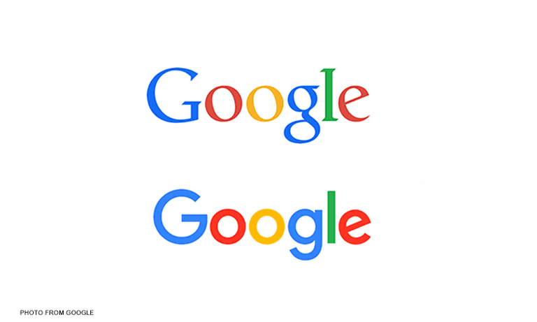
The company unveiled its new look on Tuesday (September 1), featuring the same color scheme but with its typeface changed into the same one used by its new parent company Alphabet.
Related: Here’s Google’s new logo
This is not the first time that the popular multinational technology giant has changed its look — having done so six times in the past.
‘ ‘7’:

Some people thought that Google was not just going to change its look but its entire identity, but were relieved to be proven wrong.
‘ ’10’: ‘contentWidth’: ‘100%’ ’embedCode’: ‘
For one brief, horrible moment, I thought the hand was going to erase "Google" and write "Alphabet" in its place. pic.twitter.com/EFyof2Xseg
— Lance Ulanoff (@LanceUlanoff) September 1, 2015
‘
This marks the first change to the logo since September 2013, and some people clearly had a hard time adjusting to the change.
‘ ’12’: ‘contentWidth’: ‘100%’ ’embedCode’: ‘
Oh my gosh, what are you doing to me?! You aren't the #Google I fell in love with anymore! How am I ever going to trust you again?!
— Nikita Gill is away writing (@nktgill) September 1, 2015
‘
GOOGLE CHANGED ITS LOGO AND NOW I DON'T KNOW WHAT'S REAL
ANYMORE— John Scalzi (@scalzi) September
1, 2015
The friendlier new look also raised some eyebrows from those that believe that Google is out to rule the world.
‘ ’17’: ‘contentWidth’: ‘100%’ ’embedCode’: ‘
Google's new logo looks less threatening, which probably means they're getting ready to do something more threatening pic.twitter.com/nP12IGJLna
— Ben Greenman (@bengreenman) September 1, 2015
‘
But overall, the new look was generally regarded as a winner.
The new logo of #Google is super cute!
— M a r c e l l e (@mipzabat97) September 1, 2015
I like the Google rebrand, btw. If anyone can own that and wear it well, it’s them. They’ve proven that the last few years.